
Charles Schwab Guest Market Comment: Is the Stock Market Disconnected From the Economy?

Is the stock market disconnected from the economy? Perhaps, but less so lately given stronger economic data. Looking under the hood of performance trends over the past year reveals a nuanced relationship between the stock market and the COVID-19 economy.
Before getting to the many unique characteristics of the COVID cycle, an important reminder to investors is that stocks generally lead the economy. In fact, the S&P 500® index is one of the 10 components of The Conference Board’s Leading Economic Index (LEI). The LEI is only 0.4% below its prior peak from July 2019 and has erased nearly all of its pandemic-related decline.
Because stocks tend to lead the economy, it’s typically the case that at major stock market inflection points, the economic data is typically lagging. In other words, market peaks have generally preceded recessions’ starts, and market troughs have generally preceded economic recoveries’ starts.
As the table below shows, in the post-WWII era, there was only one exception to bear markets starting and ending before recessions started and ended, respectively. Although the 2000-2002 bear market started before the 2001 recession began, the bear market continued for another 11 months after the short/mild 2001 recession had ended.
Bear markets have tended to start and end before recessions have started and ended
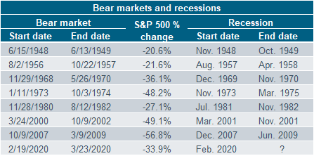
Source: Charles Schwab, Bloomberg, National Bureau of Economic Research. A bear market is defined as a 20% or greater drop in the S&P 500. Recession start and end dates are as determined by the National Bureau of Economic Research (NBER) Business Cycle Dating Committee. Past performance is no guarantee of future results.
When comparing the appreciation in stocks to the appreciation of gross domestic product (GDP), we are indeed at extremes in terms of “disconnect.” The ratio of the two is often referred to as the “Buffett Indicator,” given Warren Buffett’s oft-expressed view that it’s his favorite valuation metric. As you can see below, the ratio has never been as high as it is at present—recently exceeding the prior peak in 2000. That said, the expected surge in real GDP this year could bring this back down a bit via an increase in the denominator.
The “Buffett Indicator” is at an all-time high
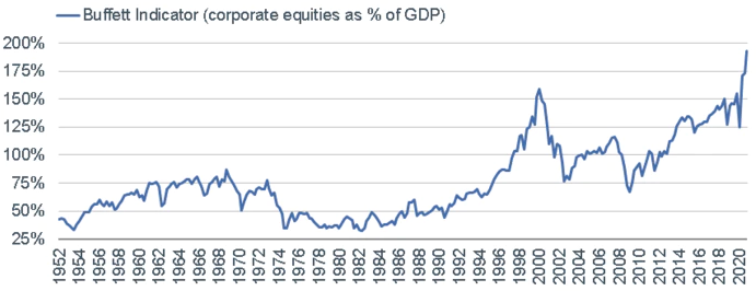
Source: Charles Schwab, Bloomberg, as of 12/31/2020.
It has been an extraordinary run for stocks since the short-lived COVID-19 bear market ended in March 2020. The chart below shows just how unique the past year has been. We looked at every S&P 500 decline of at least 25% from an all-time high since the mid-1950s, and then tracked the subsequent rebounds. Needless to say, the stock market’s recovery has been exceptionally strong.
The S&P 500 index has rebounded strongly from its March 2020 low
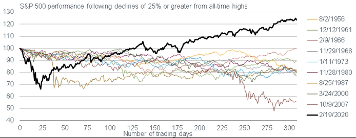
Source: Charles Schwab, Bloomberg, as of 5/10/2021. Data indexed to 100. Past performance is no guarantee of future results.
Here’s where we look under the hood. From the start of 2020 through the early part of September 2020, performance was heavily biased toward a very small subset of stocks. The so-called “big 5” are the largest five stocks by market capitalization in the S&P 500, and currently include Apple, Microsoft, Amazon, Google (Alphabet) and Facebook.
As of September 2, 2020, the big 5 accounted for more than 25% of the S&P 500 (remember, it’s a cap-weighted index). Year-to-date through September 2, 2020, the big 5 were outperforming the other 495 stocks by a whopping 62 percentage points, as you can see in the chart below. At that point last year, the big 5 were up 65% on average, while the entire rest of the S&P 500 was up only 3% on average. At that time, it was also the case that nearly 40% of the S&P 500’s stocks were still in bear markets (down at least 20% from their 52-week highs). The moral of that story is that for the first five or so months of the market’s rebound, the market was characterized by a very small handful of COVID-19 “thrivers,” while the rest of the market remained in a beleaguered state. That was certainly reflective of the behavior of the economy at that time.
Since September, the big 5 have taken a breather relative to the rest of the market, which has reflected the broadening out in economic growth, given continued reopening efforts and an increasing number of vaccinations. As is now the case with the economy, areas of the market that lagged last year have had the chance to catch up.
The big 5 outperformed the rest of the S&P 500 in 2020
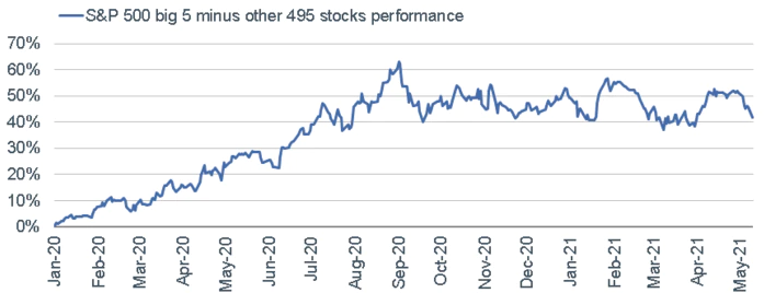
Source: Charles Schwab, Bloomberg, as of 5/10/2021. Big 5 stocks include Apple, Microsoft, Amazon, Google (Alphabet) and Facebook. Past performance is no guarantee of future results.
The characteristics noted above can be further fleshed out by looking at two sets of stock market cohorts. The chart below shows the comparative performance of the so-called “COVID winners” and “COVID losers.” As you can see, it wasn’t until early November that the latter cohort began playing catch-up to the former cohort—timed, not coincidentally, with the initial positive news about COVID vaccine efficacy. The latest moves took the “losers” cohort to comfortably above the “winners” cohort; and a wider divergence has opened up lately as some larger, tech-oriented stocks have weakened.
“COVID losers” began to catch up in November 2020
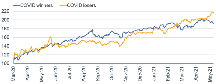
Source: Charles Schwab, Bloomberg, as of 5/10/2021. Data indexed to 100 (base value=3/23/2020). COVID winners consist of the Communication Services, Consumer Discretionary and Information Technology sectors. COVID losers include the Energy, Financials and Industrials sectors. Past performance is no guarantee of future results.
The market can be sliced and diced another way, as well. The chart below shows two Goldman Sachs-created indexes: “stay at home” stocks (those that are seen as beneficiaries of consumers spending more time and money at home) and “re-opening” stocks (those likely to benefit from consumers spending less time/money at home). Again, the timing of the pickup in relative performance by the re-opening stocks was also pinned to early November 2020; with the latest moves bringing the “re-opening” cohort comfortably above the “stay at home” cohort.
Re-opening stocks began to perform relatively better in November 2020
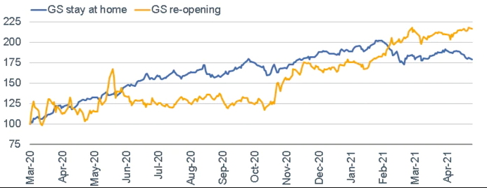
Source: Charles Schwab, Bloomberg, as of 5/10/2021. Data indexed to 100 (base value=3/23/2020). The GS stay at home basket consists of U.S.-listed equities that may benefit from consumers spending more time and money at home. The GS re-opening basket consists of U.S. listed equities that may benefit from consumers spending less time and money at home. Past performance is no guarantee of future results.
Throughout all the fits and starts of economic activity associated with the implications of the virus/pandemic, the market has also displayed a heightened level of sector rotation and volatility. This is another way to illustrate that there has been some connection between the stock market’s behavior and leadership shifts; and the economic volatility associated with the pandemic.
The table below is a take on the well-known “quilt” chart we often show that ranks broad asset classes based on yearly performance. In this case, we are ranking the S&P 500’s 11 sectors, and doing it on a monthly basis.
Even with a quick glance, you can see that sectors have been all over the page in terms of performance wins and losses. Take a look at the Materials sector as an example. Its one-year performance (far right column) is now at the top of the ranking through March 2021, yet it was the best-performing sector in only one month over the full span. That is in contrast to the Utilities sector, which is at the bottom of the one-year ranking; yet it was the best performer in two months during the full span.
Sector “winners” and “losers” have changed position frequently
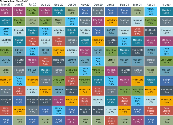
Source: Charles Schwab, Bloomberg, as of 4/30/2021. Sector performance is represented by price returns of the following 11 GICS sector indices: Consumer Discretionary Sector, Consumer Staples Sector, Energy Sector, Financials Sector, Health Care Sector, Industrials Sector, Information Technology Sector, Materials Sector, Real Estate Sector, Communication Services Sector, and Utilities Sector. Returns of the broad market are represented by the S&P500. Indexes are unmanaged, do not incur management fees, costs and expenses and cannot be invested in directly. Past performance is no guarantee of future results.
If we look at weekly performance, we see an even starker picture of sector volatility (again, associated with heightened economic volatility). In the chart below, the yellow dots represent the return for each sector since the March 23, 2020 low. The blue bars represent the number of weeks each sector was the top performer among all 11 sectors, while the green bars represent the number of weeks each sector was the worst performer among all 11 sectors. One standout is the Energy sector. The sector’s gain since the March 23, 2020 low is near the top of the leaderboard, yet it was the worst performer during nearly as many weeks as it was the best performer. Consumer Staples has been the worst performer since the March 2020 low, which is corroborated by the fact that it has spent more weeks as the worst performer than best performer.
Weekly sector performance has been volatile
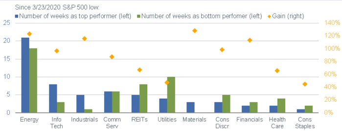
Source: Charles Schwab, Bloomberg, as of 5/7/2021. Indexes are unmanaged, do not incur management fees, costs and expenses, and cannot be invested in directly. Past performance is no guarantee of future results.
In sum, looking under the hood of the stock market’s behavior over the past year shows a bit more of a connection than is generally perceived. That said, a lot of prospective good economic news is now priced into the market. Much as the stock market tends to anticipate coming economic strength, it also tends to anticipate when economic strength is peaking. In other words, the discounting nature of the stock market works both ways. This bears watching as we move further into the year, given that (for now) the final and most recent round of fiscal aid is behind us and we may be approaching peak growth rates in some economic data. That differs from a peak in the overall level of growth and doesn’t suggest the expansion is ending; but does tend to bring on a higher level of market volatility.
About the Author:
Liz Ann Sonders
Senior Vice President, Chief Investment Strategist, Charles Schwab & Co., Inc.
https://www.schwabfunds.com/author/liz-ann-sonders